The Disco Collective
Building a destination for shopper discovery.
Shoppers discovered new products only in Disco's post-purchase experience, a long scrolling list shown after checkout. They wanted more. We shaped The Disco Collective: a place for shoppers to discover brands beyond checkout. Research-grounded, prototyped, tested. Discovery as a destination, not a moment.
The Show More signal
A Show More button sat at the bottom of Disco's post-purchase page. Shoppers tapped it more than they clicked individual products. Click-through stayed near 0.3%; Show More ran several times higher.
The page wasn't built for that demand.
Three needs surfaced
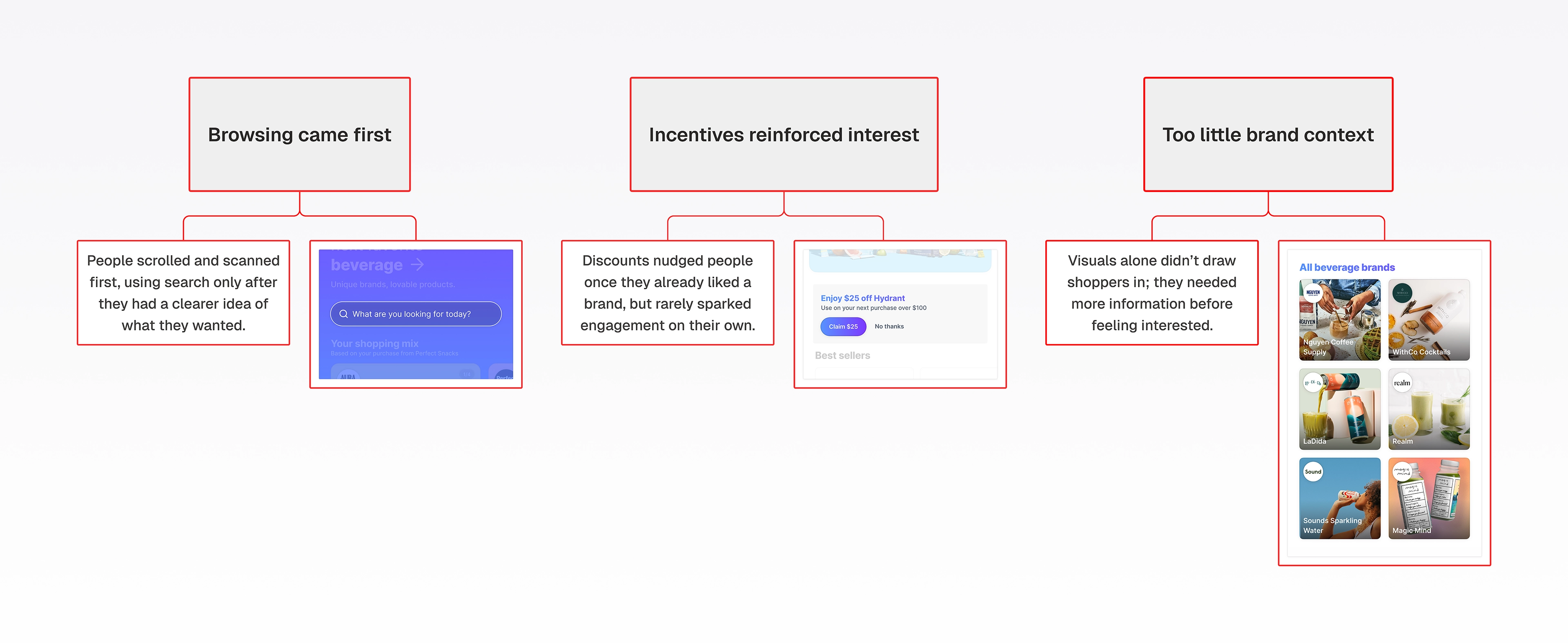
We prototyped the destination and tested it with shoppers, focused on what made each brand worth the click. Three needs surfaced. Categories needed to make sense at a glance. Transitions between related brands needed to feel smoother. Details needed to surface before the click.
These weren't preferences. They were what discovery needed to work.
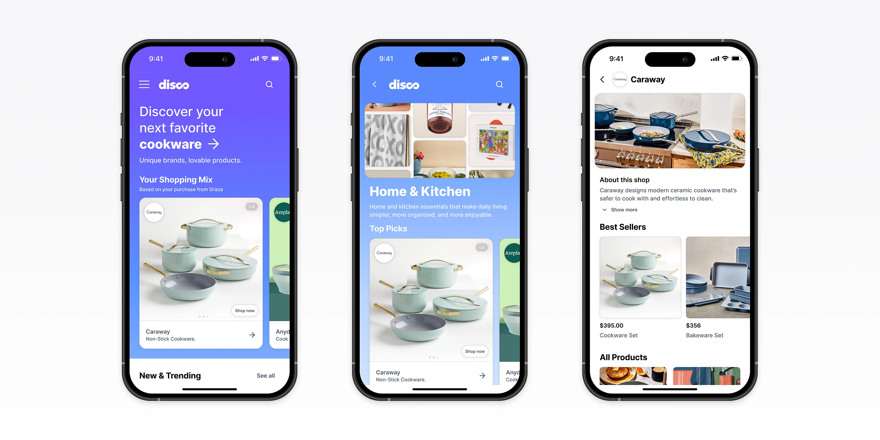
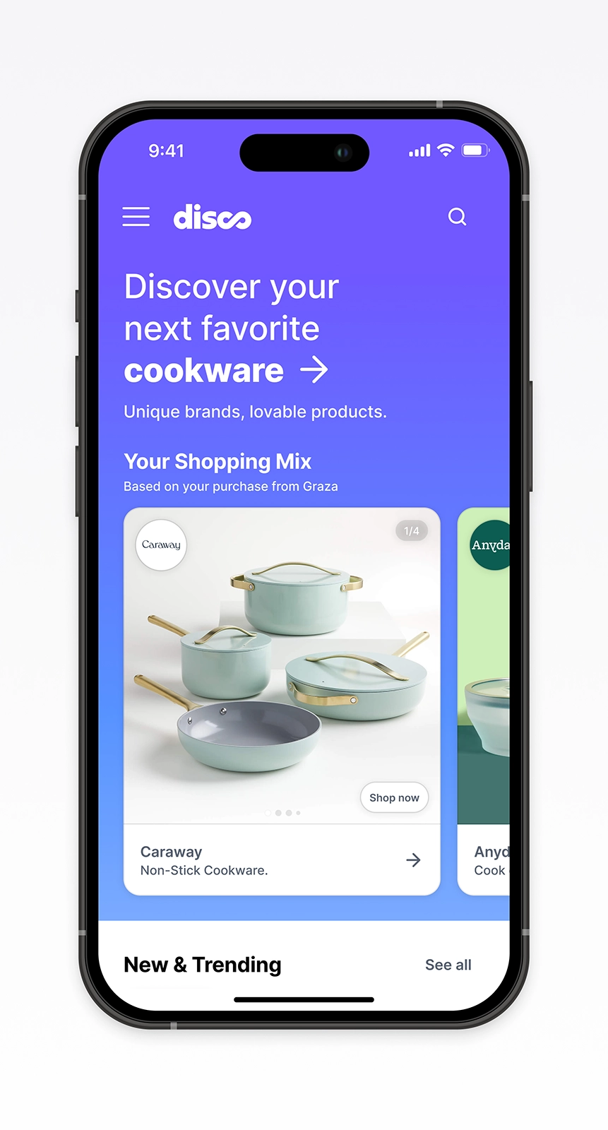
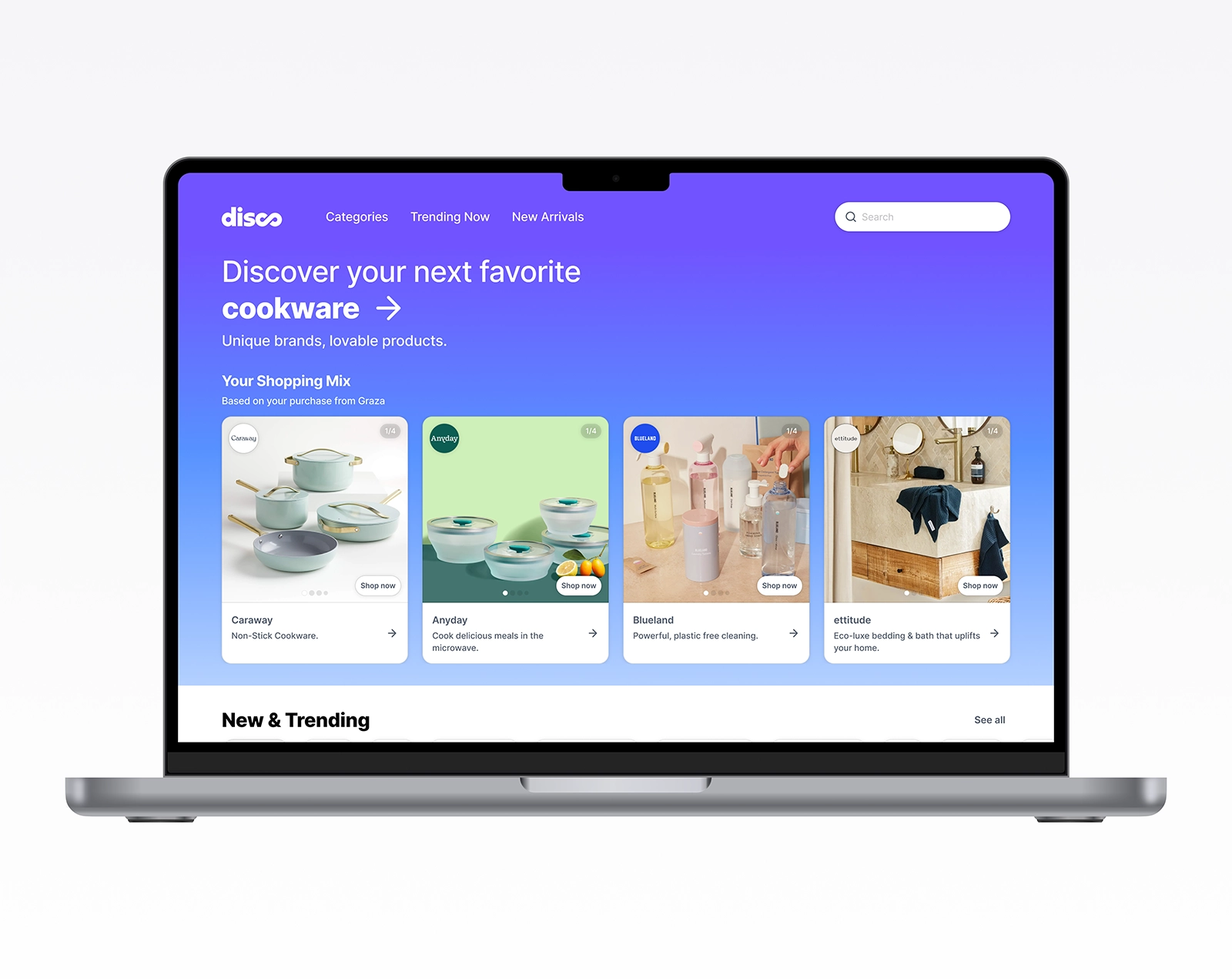
Home page
Category page
Brand page
What we had to rethink
Testing also broke several assumptions about how shoppers behaved.
Shoppers browsed first, used search only after they had direction, and wanted context before committing. Discounts reinforced interest but didn't drive exploration on their own.
Discovery was slower and more deliberate than we'd assumed.
Destination, not directory
We reframed The Disco Collective from a directory into a destination.
Discovery couldn't stay tied to the checkout moment. The slow, deliberate process shoppers wanted needed a place of its own.
The MVP focused on the basics: brand-led discovery, context surfaced before the click, and routes shoppers could return to.
Personalization, richer search, reviews, and rewards waited for later phases.
Start with exploration
Categories shape the path
Story surfaced early
The core experience
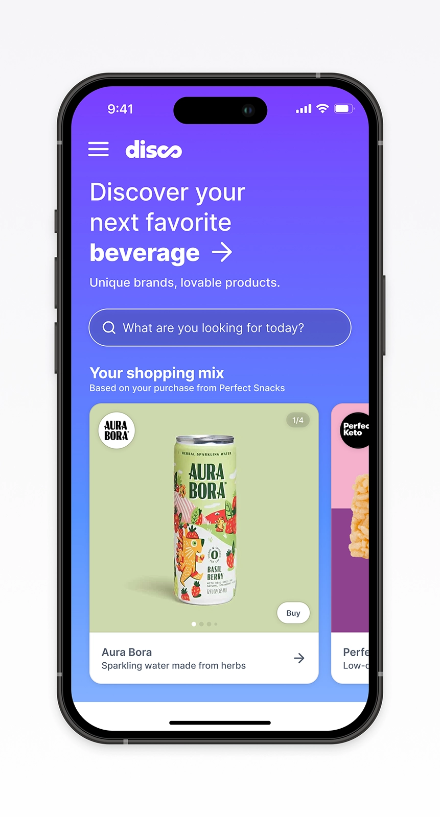
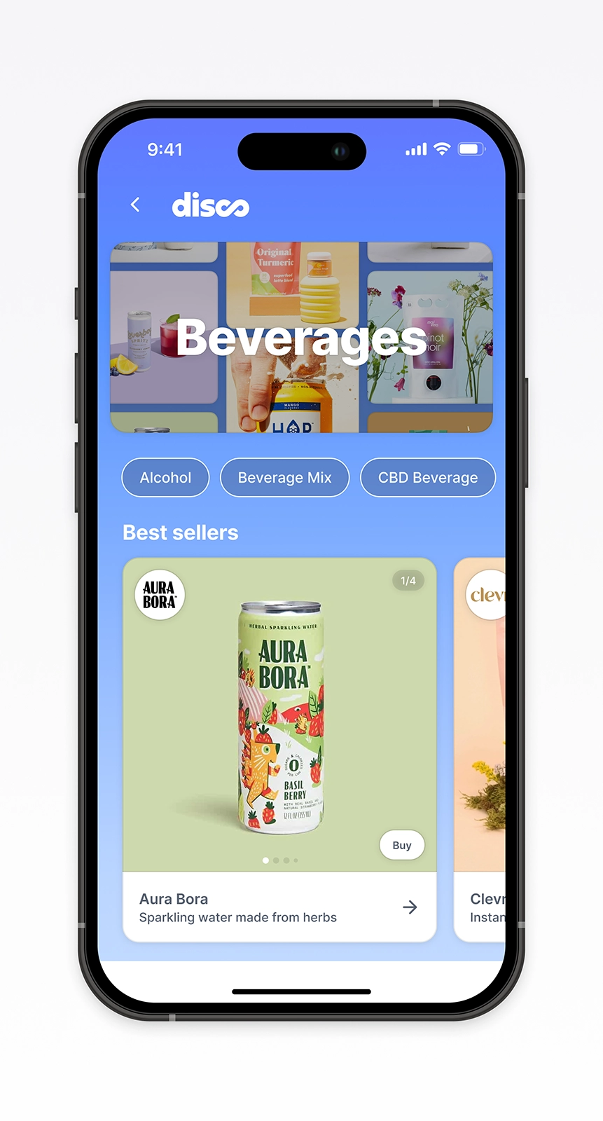
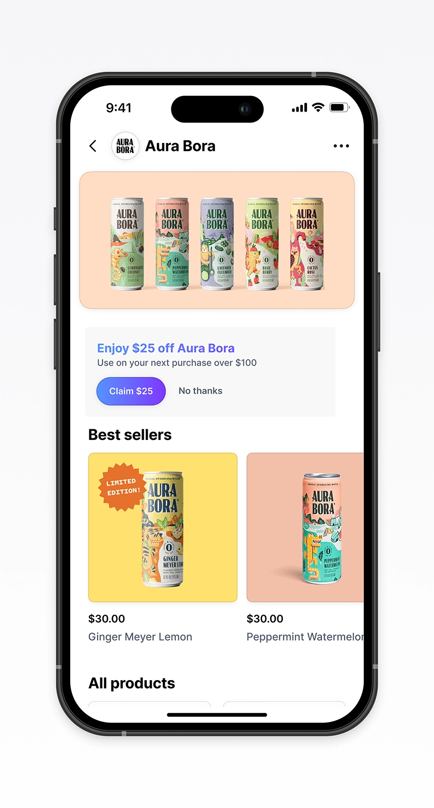
The destination came together across three surfaces.
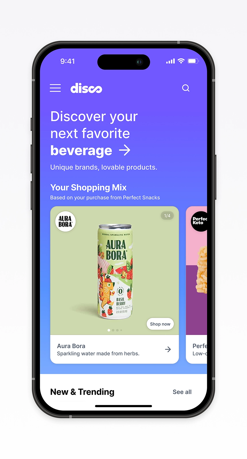
The home led with brand cards anchored to a shopper's last purchase, a personalized mix of brands they might like next. Curated rows and a brand grid ran beyond it.
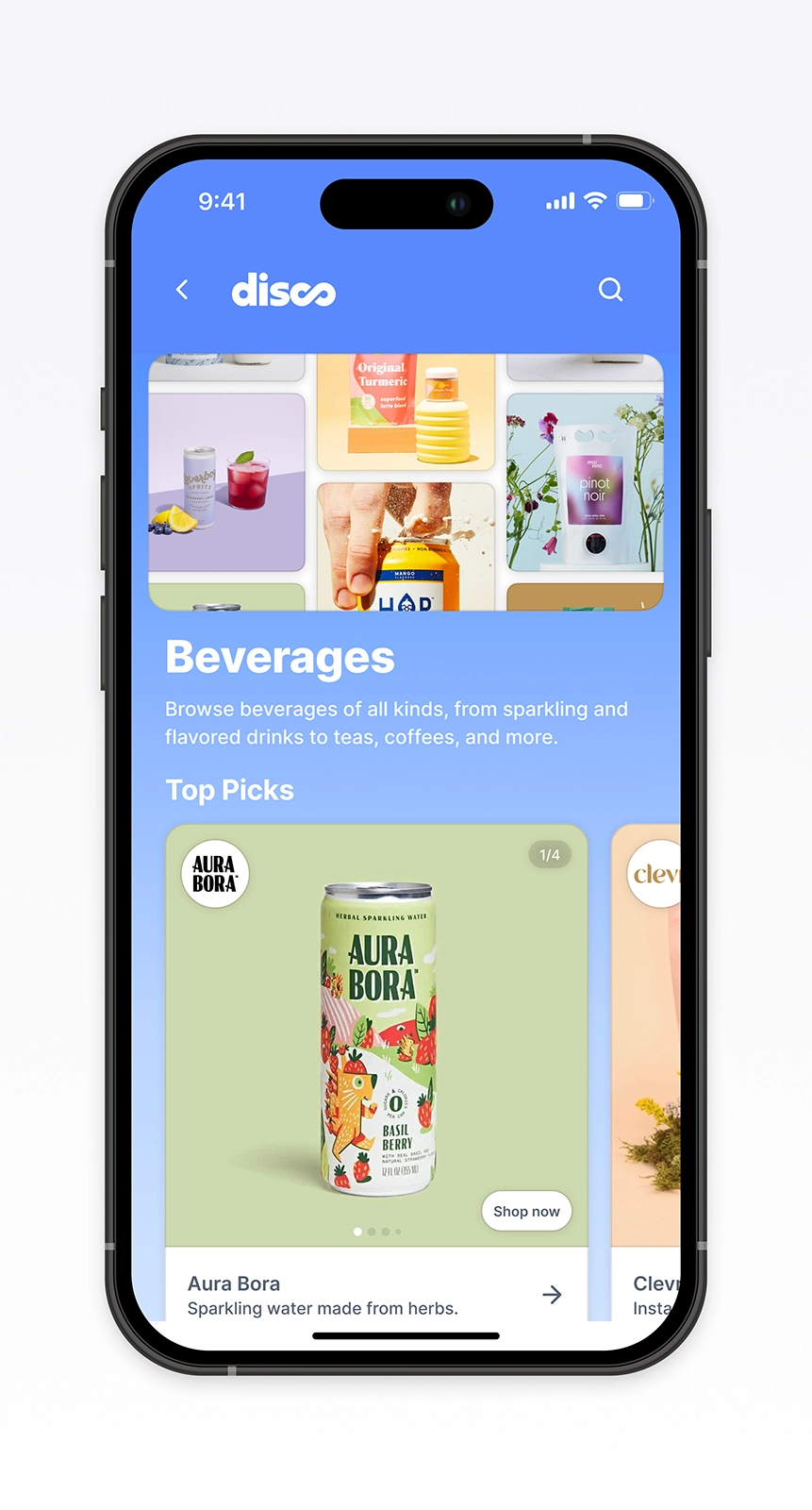
Categories opened into editorial hero collages, then ran Best Sellers, New Arrivals, and a brand grid below. Load More Brands sat at the bottom. Show More, but with a destination.
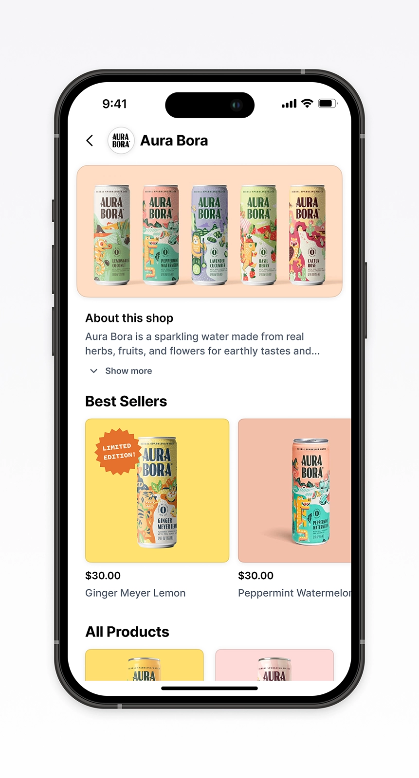
Brand pages led with the brand: logo, name, hero image. Category, values, social, and website appeared above the products. Similar Brands at the bottom returned shoppers to the network rather than dead-ending the page.
The supporting patterns
Carousels paced the rows deliberately. One card at a time, swipe to advance.
Search worked as a shortcut, not a starting point. Shoppers used it to narrow results once they had direction.
Density stayed controlled. Brand bios expanded on tap. The menu nested categories alongside brand values. Nothing crowded the page.
Interactive carousels
Search as a shortcut
Controlled density
Where it landed
The destination was research-grounded, prototyped, and tested. It came together across design, product, and engineering. The business pivoted before launch, and it didn't ship.
The case the research made still holds: discovery is a destination, not a moment.
Credits
- Product Manager: Dan Kaufman
- Frontend Engineer: Aryan Gupta